Simplified navigation
Redesigning the navigation for a complex procurement sourcing platform, condensing a 7-step flow without losing access to any of the core functionality.
The brief
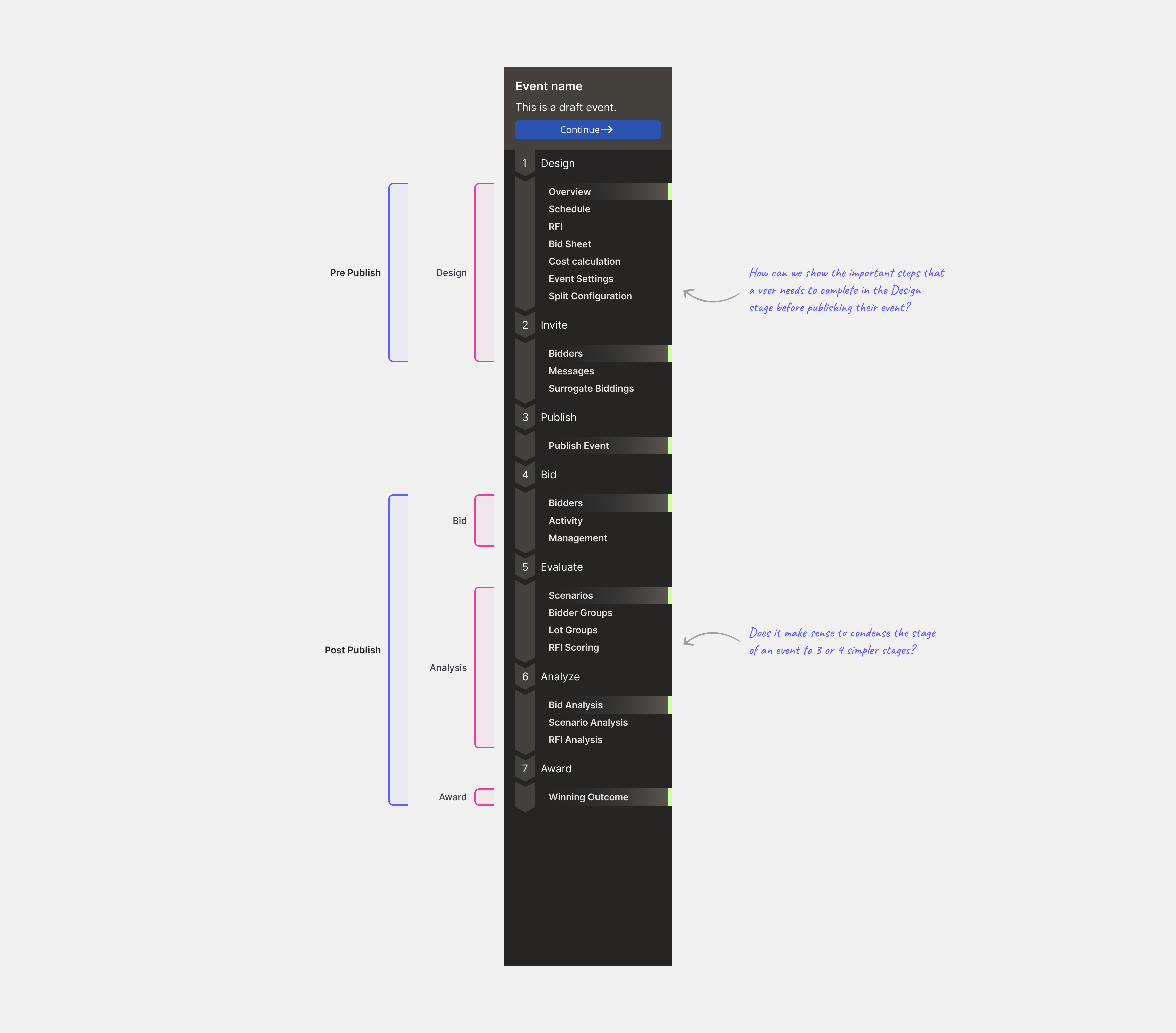
The navigation of Keelvar's sourcing v1 platform overwhelmed users. The existing side navigation used an accordion to reveal pages across seven different steps. When users created a new event, they lacked a clear starting point and direction for what to do next. Being part of the team working on sourcing v2, which aimed to reimagine the Sourcing Optimizer product, we had 2 tasks:
- Simplify the navigation
- Provide users with a clear understanding of their next steps post event creation
The original side navigation.
Explorations
Before exploring concepts, I mapped the existing nav from an information architecture perspective to identify which pages could be logically grouped or consolidated across the 7 steps.
Early explorations
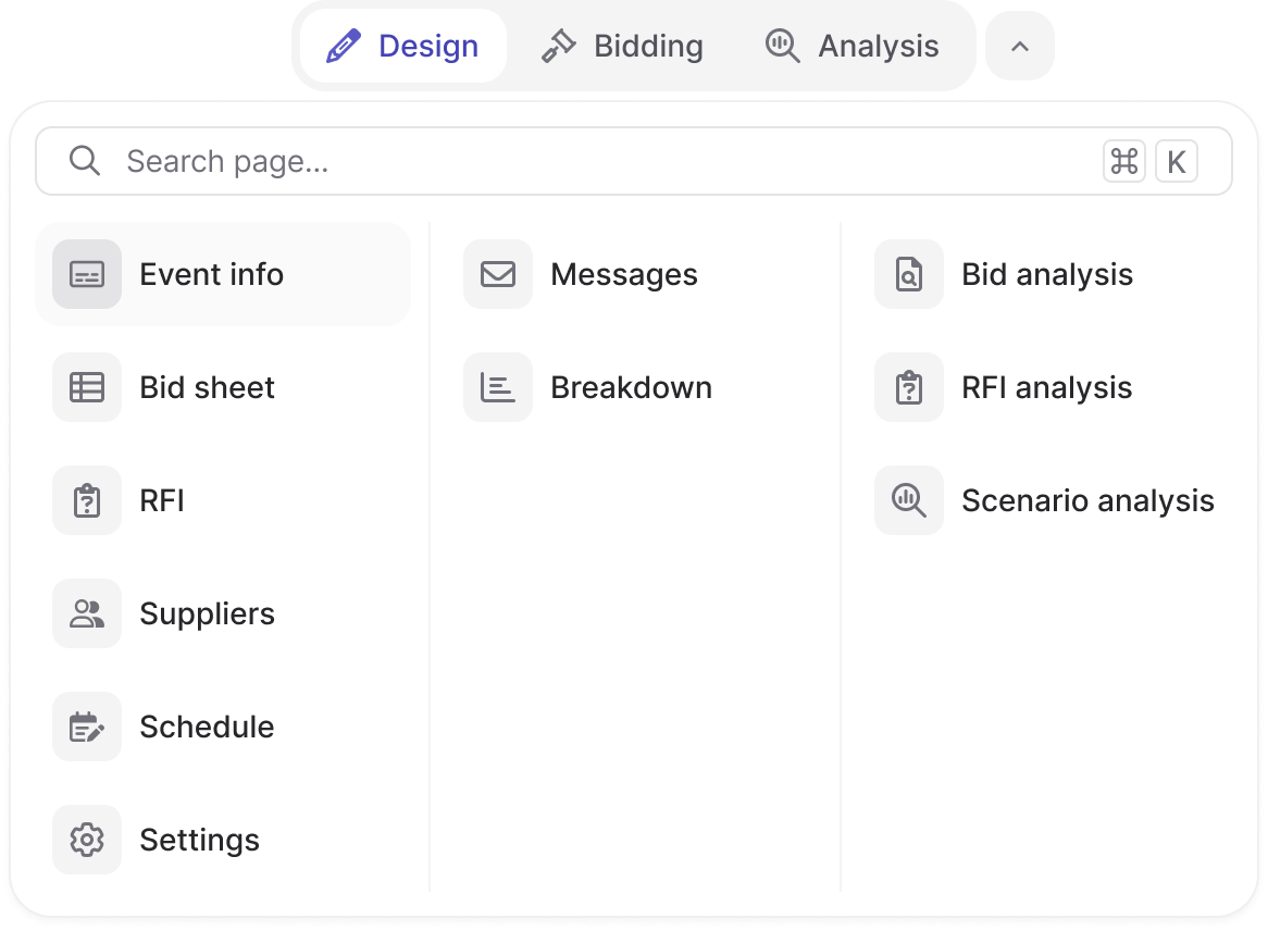
Exploring different ways to condense the navigation into 3-4 simpler event stages. The main goal was to transition from a vertical side navigation to a top navigation.
A full-width panel with top-level tabs. Showed a lot of content at once but the visual weight created cognitive overload in early feedback sessions.
Refined concept
We ran a workshop with the PM, engineers, and myself. We shared ideas of concepts from Figma Make to quickly coded prototypes. We narrowed it down to a combination of 2 concepts which I refined further before sending final feedback.
Categories left, sub-items right, with a featured slot at the bottom. Good hierarchy but required editorial maintenance to keep the featured area relevant.
Internal feedback
- The user should see what step they're on at all times.
- They should quickly be able to access other pages, even when in subpages.
- Reducing the number of steps to make event management feel simpler was important.
Old navigation flow
Below shows how the user previously navigated to the 'Scenario Analysis' page.
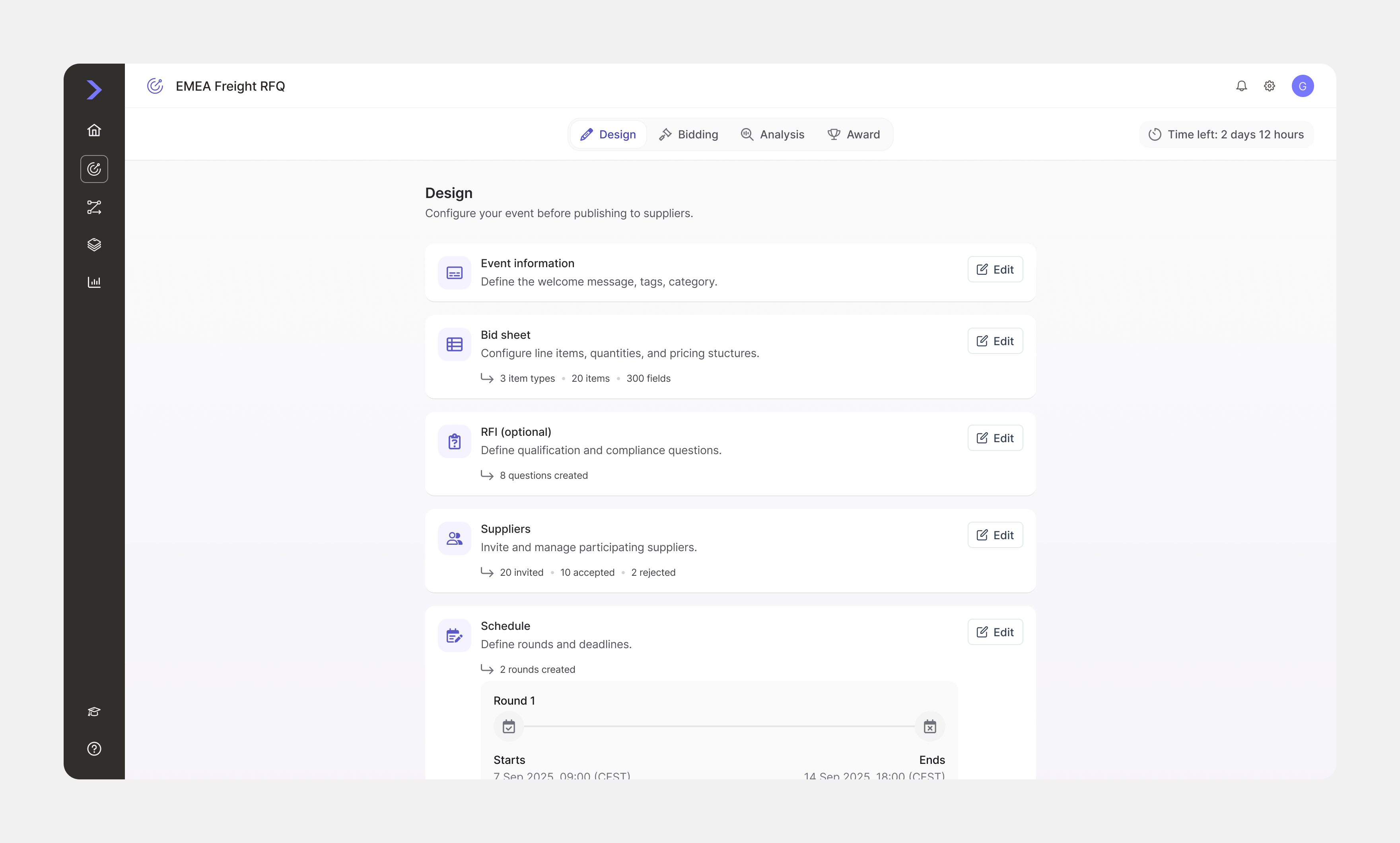
Overview page
Previously, when a user landed on a newly created event, they were taken to an event information page with no indication of what needed to be completed before publishing. Errors only surfaced at the point of publish, forcing users to fix issues and try again.
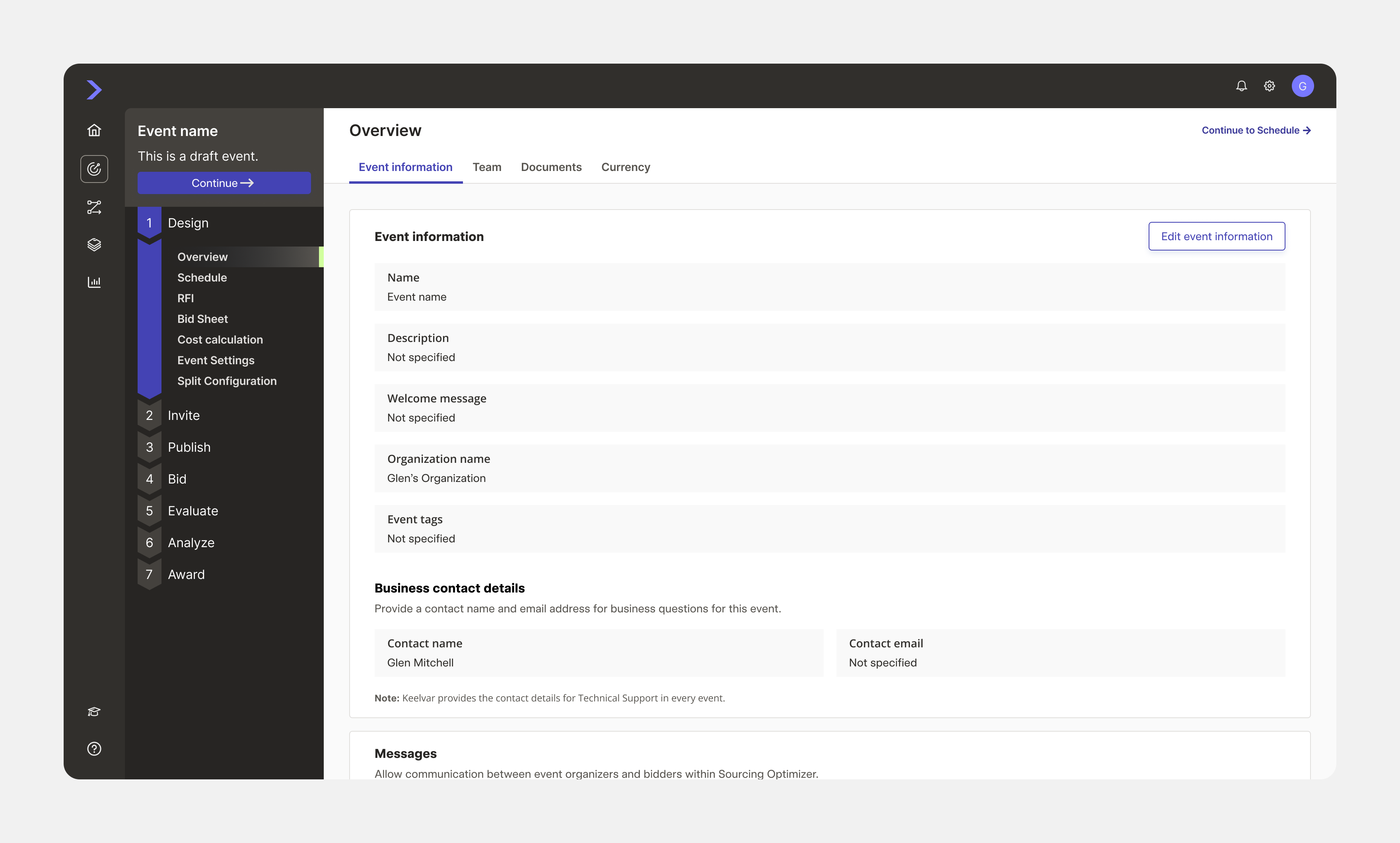
Original landing place for the user
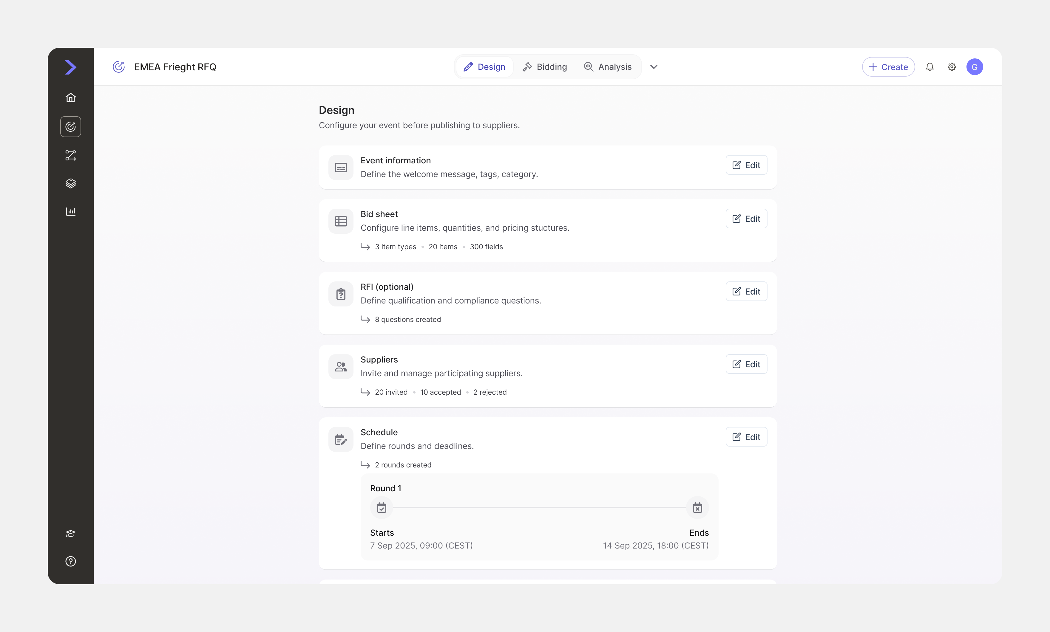
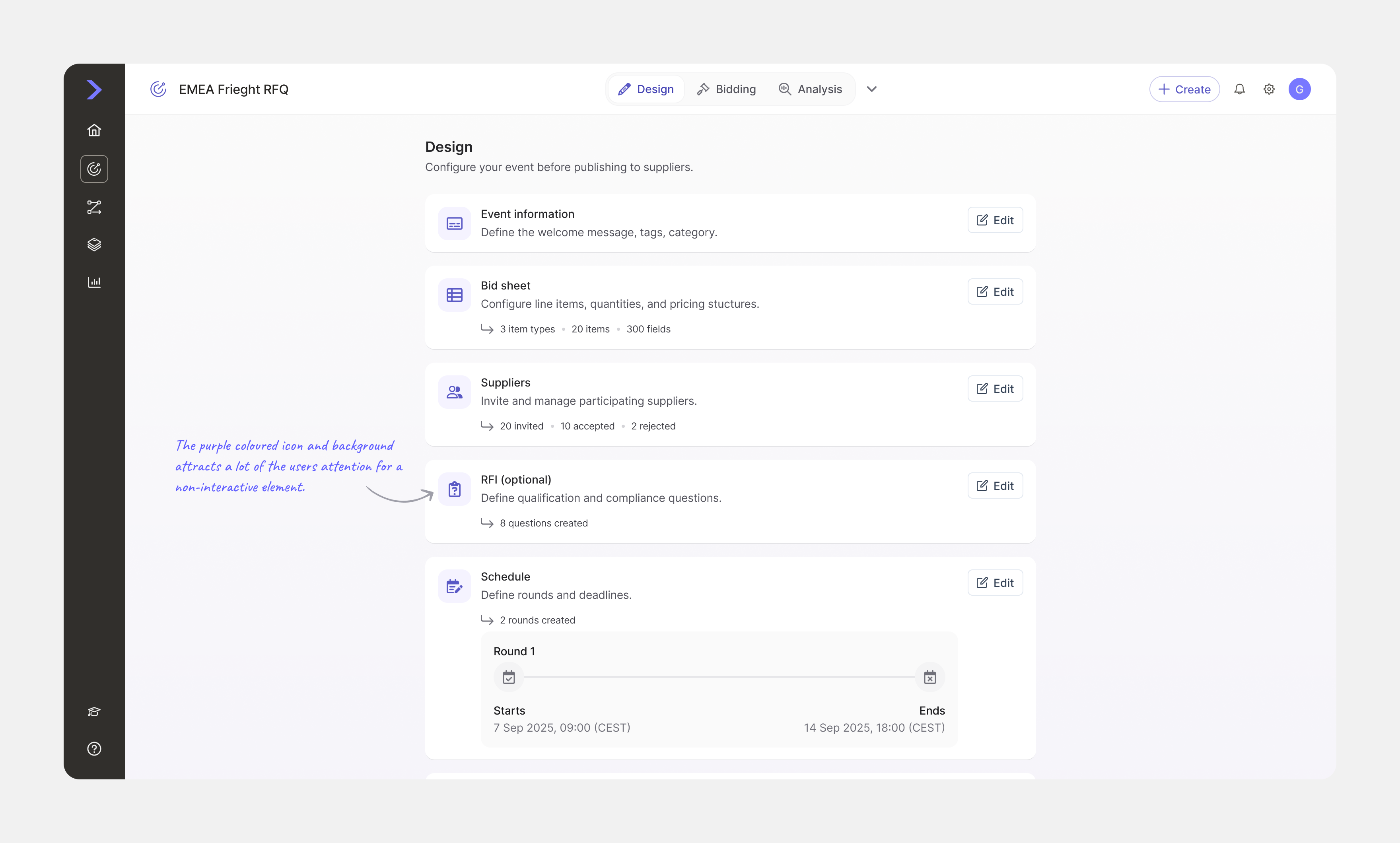
The new overview page front-loads all required tasks, with optional ones clearly marked. Users can work through and check off each task before publishing, reducing errors and giving them a clear path forward.
Conclusion
A few of the more significant choices made during the project — and the reasoning behind them.
Interactive prototype
Click on tabs and subpages in the dropdown menu.